When people think about a beautiful aesthetic color palette, they often imagine colors that feel calm, warm, and visually comforting. Among the many palettes that appear in fashion, home decor, and social media styling, burgundy, cream, and dusty pink continue to stand out. These three shades have a soft but expressive charm that makes them perfect for a feminine cozy aesthetic.
They are not loud in an overwhelming way, but they are not plain either. Together, they create a balanced mood that feels romantic, warm, elegant, and deeply comforting. That is why this color combination appears so often in cozy bedrooms, fall outfits, Pinterest boards, café corners, reading nooks, and lifestyle content.
If you have ever wondered why these shades work so well together, the answer is simple: each color brings a different emotional effect, and together they create a complete visual story.
Why this aesthetic color palette feels instantly cozy
A cozy visual style is usually built around warmth, softness, and emotional comfort. Colors play a major role in that feeling. Burgundy, cream, and dusty pink all support that mood in different ways.
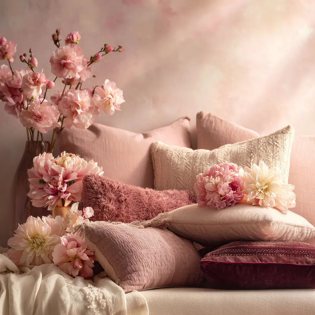
Burgundy adds richness and depth. It feels mature, warm, and slightly dramatic. Cream brings lightness and softness. It keeps the palette from feeling too heavy. Dusty pink adds a gentle feminine touch without becoming too sweet or childish.
This is why the palette feels so complete. It has darkness, softness, and warmth all at the same time. That balance makes it especially appealing for anyone who loves a soft aesthetic color palette that still has personality.
Burgundy brings depth and warmth
Burgundy, sometimes described as wine red or deep red, is one of the most important colors in this palette. It gives the look emotional depth. Unlike bright red, burgundy feels quieter and more sophisticated. It has warmth, but it also has a slightly moody quality that makes it perfect for cozy styling.
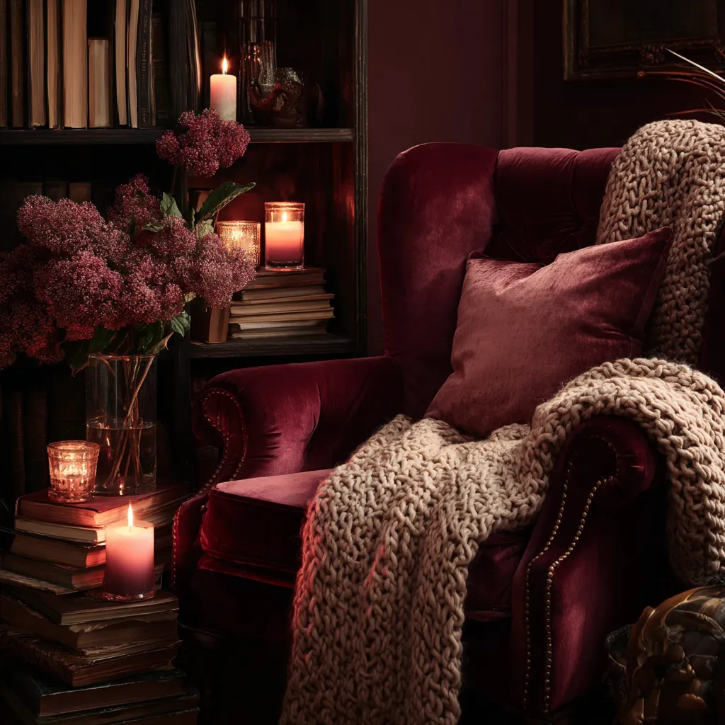
In home decor, burgundy can make a room feel intimate and welcoming. In fashion, it often looks elegant and timeless. In visual content, it creates contrast and helps softer tones stand out more beautifully.
This is why burgundy works so well in a feminine cozy setting. It adds strength without ruining the softness. It makes the overall aesthetic feel richer and more memorable.
Cream softens everything
A palette with only burgundy and pink could easily start to feel too dense or overly romantic. Cream is the color that solves that problem. It acts as a visual breath of fresh air.
Cream is softer than pure white, which is why it feels more comforting. White can sometimes look too sharp or too cold. Cream, on the other hand, feels warm, gentle, and natural. It is one of the easiest shades to use when building a cozy atmosphere.
In a room, cream makes the space feel open and calm. In an outfit, it balances stronger tones. In branding or content styling, it creates that clean and airy background that lets richer colors shine.
This is why cream is such an important part of this aesthetic color scheme. It keeps the palette feminine and soft while helping the entire look stay polished.
Dusty pink adds a feminine softness
Dusty pink is very different from bright pink. It feels muted, calm, and elegant. That is exactly why it works so well in a cozy aesthetic.
Many people want a feminine style, but they do not want it to look too childish or overly sugary. Dusty pink solves that beautifully. It adds softness and romance, but in a more grown-up and refined way.
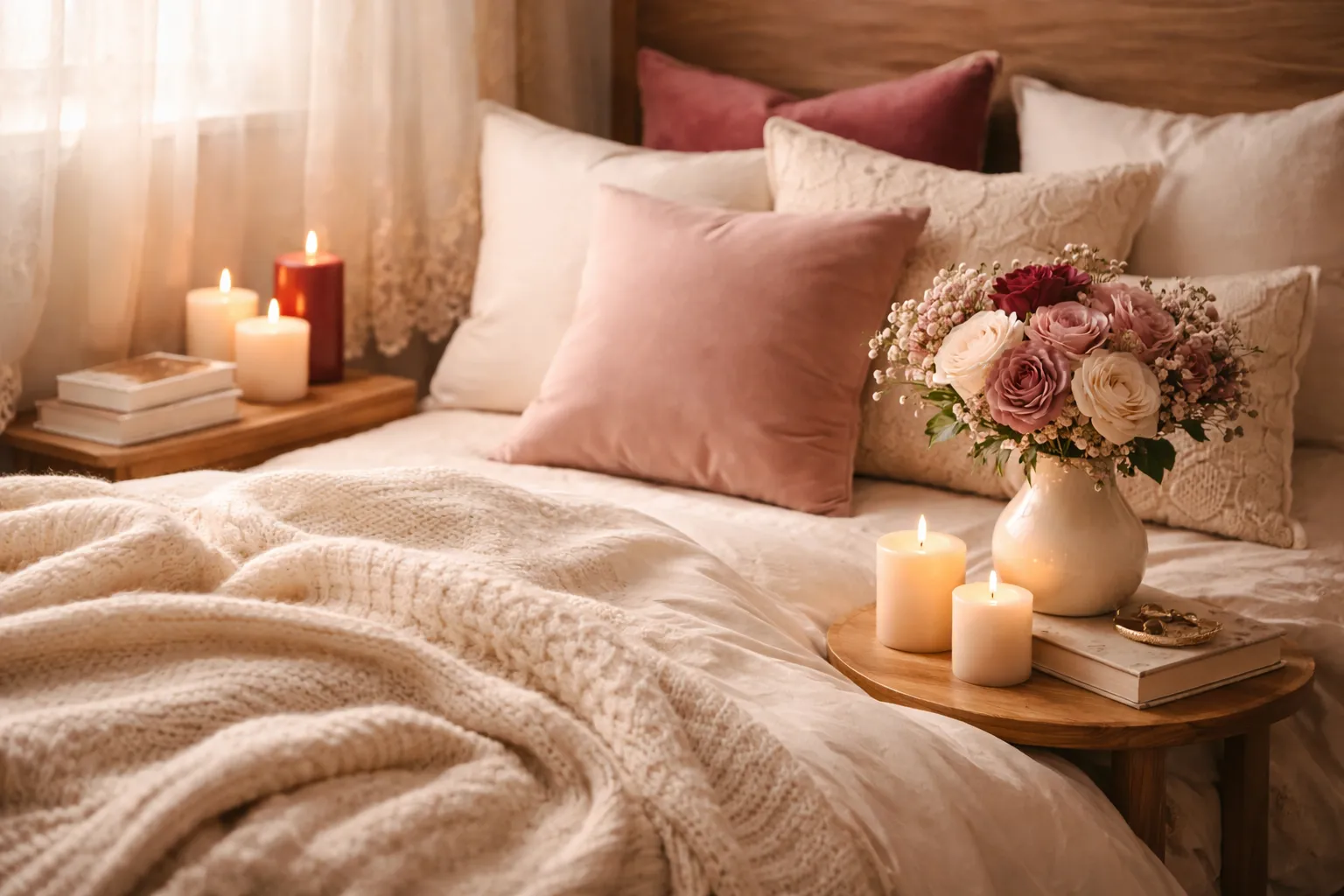
This shade works especially well in bedding, curtains, knitwear, candles, wall art, flowers, and lifestyle photography. It gives the palette a tender quality that feels emotional and inviting.
Among many aesthetic color combos, dusty pink remains one of the most loved shades because it is easy to style, flattering to look at, and naturally calming.
Why these three colors work so well together
The reason this aesthetic color combination feels so beautiful is that each color plays a different role.
- Burgundy is the anchor.
- Cream is the balance.
- Dusty pink is the softness.
If you remove one of them, the palette loses something important. Without burgundy, it may feel too pale. Without cream, it may feel too dark. Without dusty pink, it may lose part of its feminine charm.
Together, they create contrast without clashing. They feel layered, not chaotic. That is a big part of what makes a good aesthetic color palette. It should feel intentional, emotional, and visually smooth.
This combination also works across many seasons. It feels romantic in autumn and winter, but with lighter styling, it can also feel beautiful in spring. That flexibility makes it a timeless choice.
Aesthetic color palette hex codes
If you want to recreate this look in design, content creation, or decor planning, here is one simple version of the palette:
- Burgundy: #6D2736
- Cream: #F5EBDD
- Dusty Pink: #D8A7B1
These aesthetic color hex codes are a good starting point if you want a palette that feels warm, elegant, and feminine. You can always make the burgundy deeper, the cream warmer, or the dusty pink softer depending on your taste.
Adding hex codes can also help if you are building a mood board, choosing branding colors, styling a blog, or planning social media visuals.
How to use this palette in real life
One of the best things about this palette is how easy it is to use. You do not need to redesign your whole life to enjoy it.
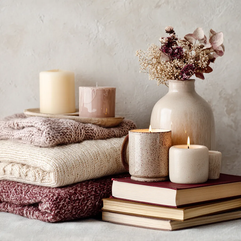
In fashion, you can pair a burgundy cardigan with a cream skirt and a dusty pink accessory. In home decor, you can use cream bedding, dusty pink pillows, and burgundy candles or throws. In content styling, this palette works beautifully for flat lays, product photography, journaling, and cozy room setups.
It also works very well for feminine brands, bookish aesthetics, romantic lifestyle content, and soft seasonal visuals. If your goal is to create something that feels comforting, tasteful, and visually warm, this palette is a smart choice.
Final thoughts
A truly beautiful aesthetic color palette does more than look pretty. It creates a feeling. Burgundy, cream, and dusty pink work so well because they speak to comfort, elegance, and softness at the same time.
Burgundy adds emotional depth. Cream keeps everything airy and calm. Dusty pink brings a gentle feminine touch. Together, they create a look that feels cozy, romantic, and timeless.
That is why these shades continue to appear again and again in soft lifestyle content, room decor inspiration, and feminine styling. They are not just trendy colors. They are colors that make people feel something warm.
If you love a soft and feminine cozy style, this may be one of the best color palettes to start with.